MY ROLE:
Head of Marketing, Abstracta
PROBLEM:
Abstracta’s WordPress website was attracting a desirable amount of traffic per month due to the strength of its blog content (around 8,000 organic visitors) but received a low amount of conversions in its sales page contact forms. Its two main problems were its design, which was not conducive to conversion, and its poor performance.
After trying several methods for increasing the page speed of our WordPress site, it was still too slow for our standards and we needed to come up with a better solution since what we offered to our clients were performance testing services. Essentially, we needed to not only “talk the talk” about the benefits of having performant web sites, but to also “walk the walk” to demonstrate our expertise in that area.
SOLUTION:
We decided to completely re-vamp our website and build it from scratch in HTML, in order to avoid performance issues, while keeping the dynamic aspects like the blog in WordPress. We also took the opportunity to add new pages that we never had before such as a careers page (to facilitate recruiting) and a resources center (to increase downloads of our lead magnets and highlight our brochures and case studies).
Here are some screen captures of the new website (the parallax scrolling is the culprit for the flaws in the image capture toward the bottom):

On the home page, we added elements we didn’t have before such as:
- One bold, central message about why Abstracta exists in the header, above the fold
- Customer logos
- Sliders of our most important content and lead magnets
- A contact form at the bottom of the page for less friction in the buyer’s journey
- Parallax scrolling
We also added a form at the bottom of every services and industry page, which has been attributed to the overwhelming increase in inquiries the site has experienced since launch.
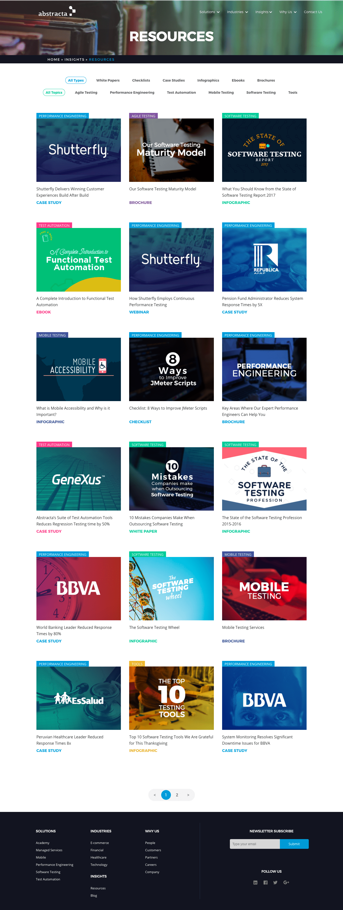
Below is the newly crafted resource center which houses all of our different forms of content in order to educate and persuade visitors that we were the right QA partner for them:

METHOD:
I managed this project with Abstracta’s graphic designer and web developer. All three of us worked from different parts of the world, (myself in California and they were in two different cities in Uruguay) but we managed to collaborate thanks to JIRA, Google Docs, Zoom, and Slack. I would generate the idea for the elements, layout, and copy of each page, using Canva to create a mockup, and then our designer would create a PDF of how it should look and the developer then coded it. Eventually, we added a tester to our team who would help us to find any issues before launch. As a team, we also worked together to make sure the site was fully responsive on mobile and that it followed the guidelines for website accessibility.
RESPONSIBILITIES:
- Manage the project timeline
- Define the site structure
- Decide the structure and messaging of each page, write the copy
- Create mockups in Canva to convey ideas for the site design to graphic designer
- Approve all colors, images and icons
- Research keywords and create meta data to rank for selected keywords for each page
- Oversee testing before and after launch
RESULTS:

- Within the first two months after launch, we saw a 400% increase in the amount of contact form completions.
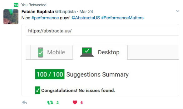
- The new site is highly performant on both mobile and desktop, helping to demonstrate our expertise in web performance.
- The user experience has vastly improved and its navigation is more simple than before.

